Reports: Charts in reports: Difference between revisions
From Planfix
No edit summary |
No edit summary |
||
| Line 1: | Line 1: | ||
In Planfix, you can add | {{#seo: | ||
|title= Reports: Charts in reports | |||
|titlemode=append | |||
|keywords=planfix, reports, charts | |||
|description= Charts in reports | |||
}} | |||
In Planfix, you can add one or more of the following chart types to any [[Reports | report]]: | |||
*[[Bar chart]] | |||
*[[Line chart | |||
*[[Pie chart]] | |||
*[[Combo chart]] | |||
*[[Funnel chart]] | |||
*[[Pyramid chart]] | |||
*[[Stacked chart]] | |||
*[[Gantt chart]] | |||
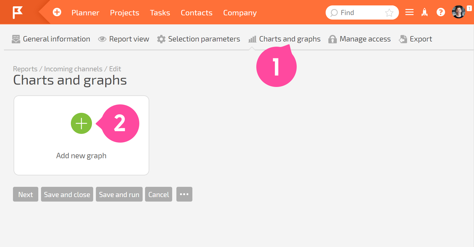
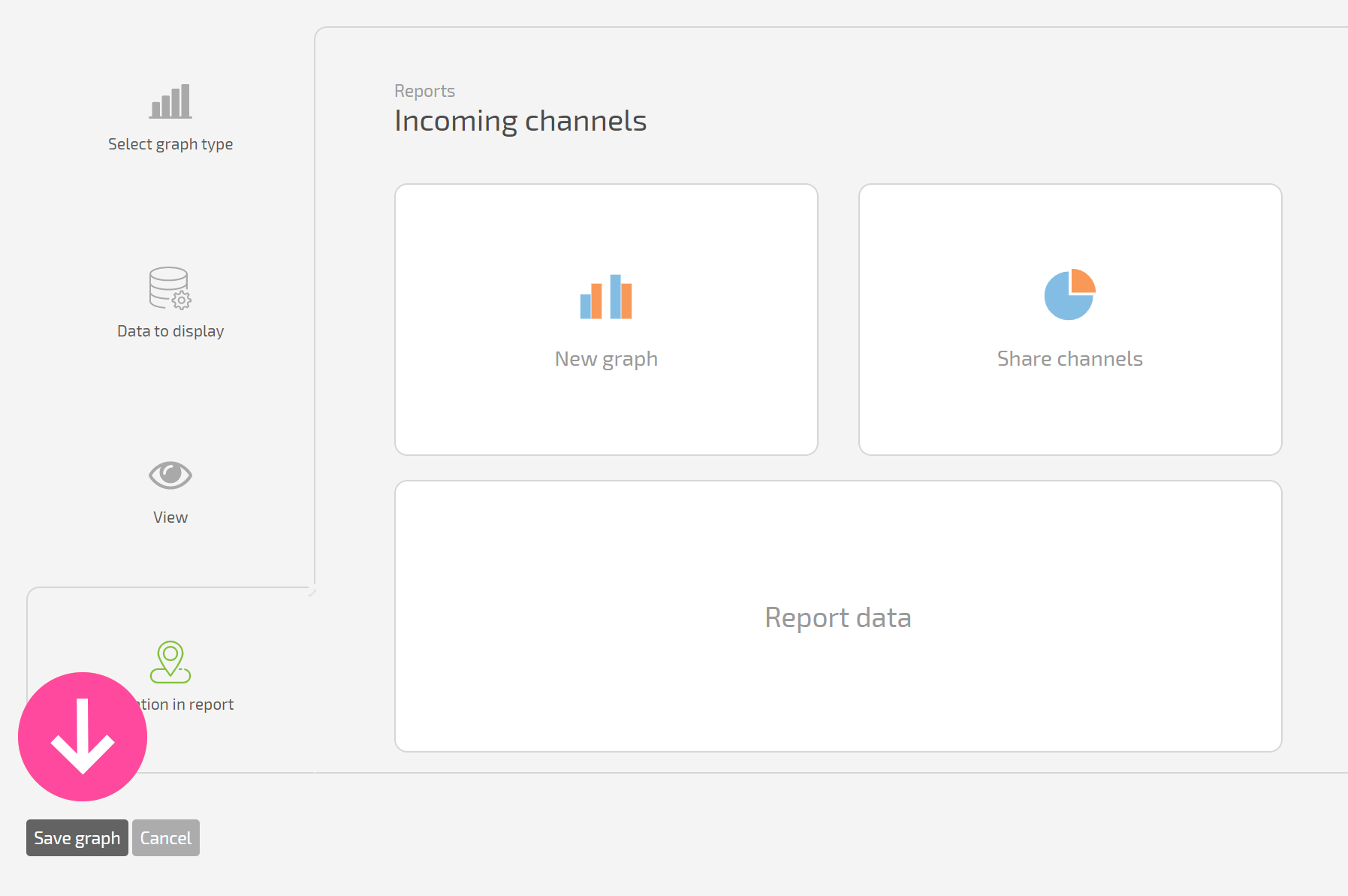
To do this, when creating or editing a report, you need to go to the '''Charts and diagrams tab''' and click '''Add new chart''': | To do this, when creating or editing a report, you need to go to the '''Charts and diagrams tab''' and click '''Add new chart''': | ||
https://pic.planfix.ru/pf/of/ogXag1.png | https://pic.planfix.ru/pf/of/ogXag1.png | ||
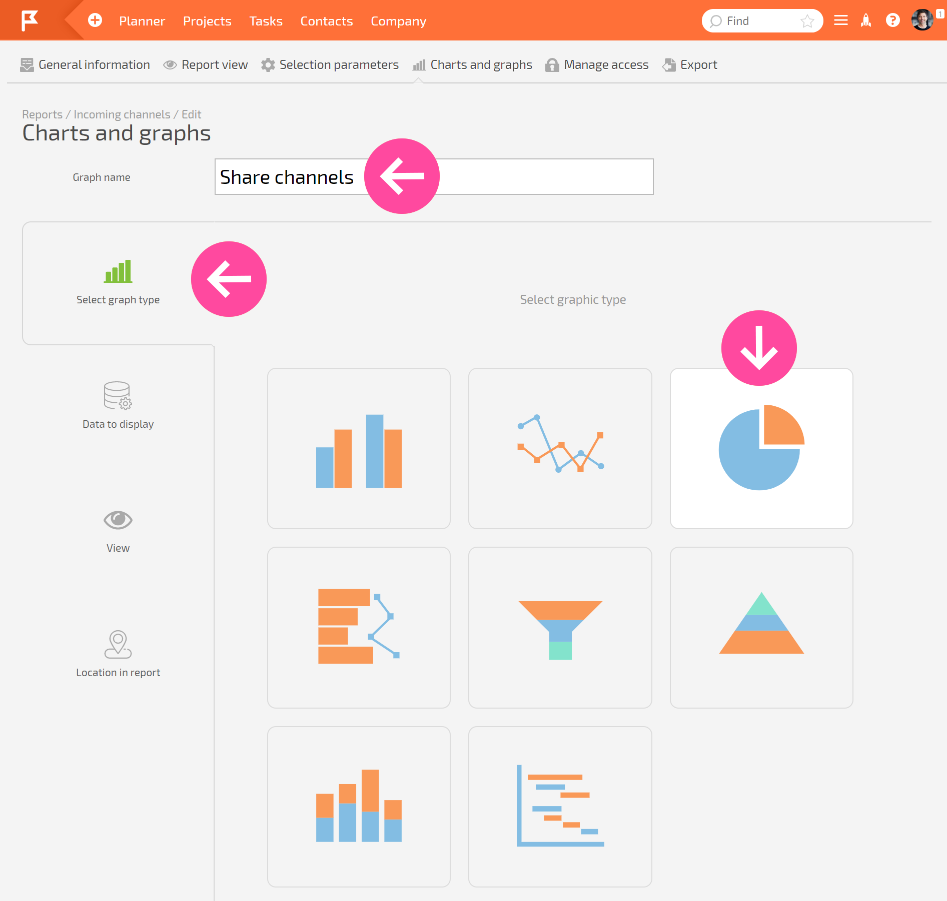
*Give the chart a name and select the diagram type | *Give the chart a name and select the diagram type | ||
https://pic.planfix.ru/pf/Lj/B5uu1I.png | https://pic.planfix.ru/pf/Lj/B5uu1I.png | ||
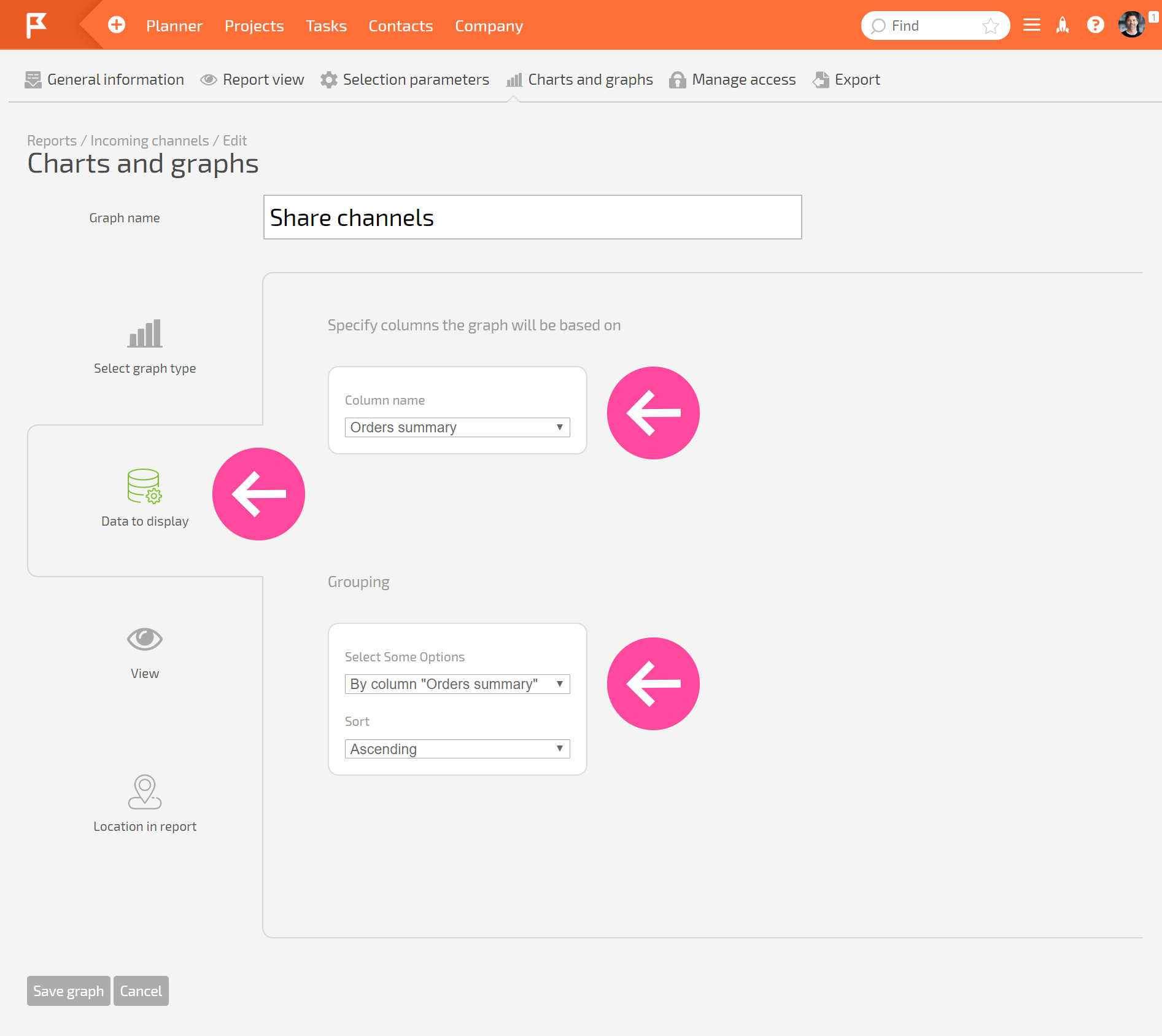
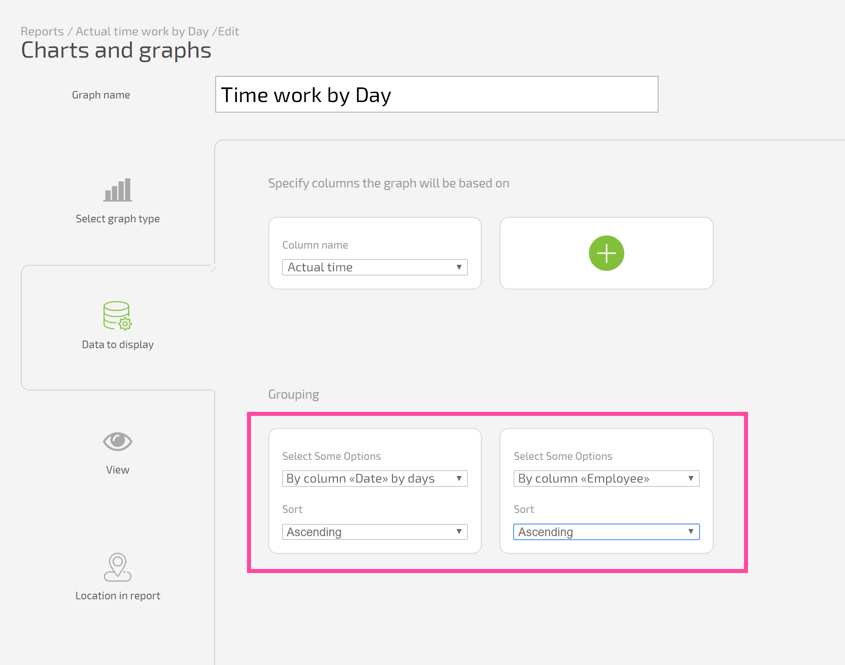
*In the tab Data for display, you must select one or more report columns to build the chart with and the grouping that will be used: | *In the tab Data for display, you must select one or more report columns to build the chart with and the grouping that will be used: | ||
https://pic.planfix.ru/pf/Qs/1b45Da.png | https://pic.planfix.ru/pf/Qs/1b45Da.png | ||
'''Please note:''' | '''Please note:''' | ||
*The data displayed in the chart will depend on the grouping you choose. We recommend that you specify this grouping in the general report settings at the beginning. Run the report and make sure that you get exactly the data you're expecting in the columns you need with this grouping. Then indicate the same column and grouping in the chart settings, so you can see this exact data as a chart. | *The data displayed in the chart will depend on the grouping you choose. We recommend that you specify this grouping in the general report settings at the beginning. Run the report and make sure that you get exactly the data you're expecting in the columns you need with this grouping. Then indicate the same column and grouping in the chart settings, so you can see this exact data as a chart. | ||
*The labels on the X axis are always taken from the grouping in the chart settings (or report settings, if no grouping is specified at the chart level). If the data isn't grouped in the chart or report settings, the labels will be taken from the source data the report is built with. | *The labels on the X axis are always taken from the grouping in the chart settings (or report settings, if no grouping is specified at the chart level). If the data isn't grouped in the chart or report settings, the labels will be taken from the source data the report is built with. | ||
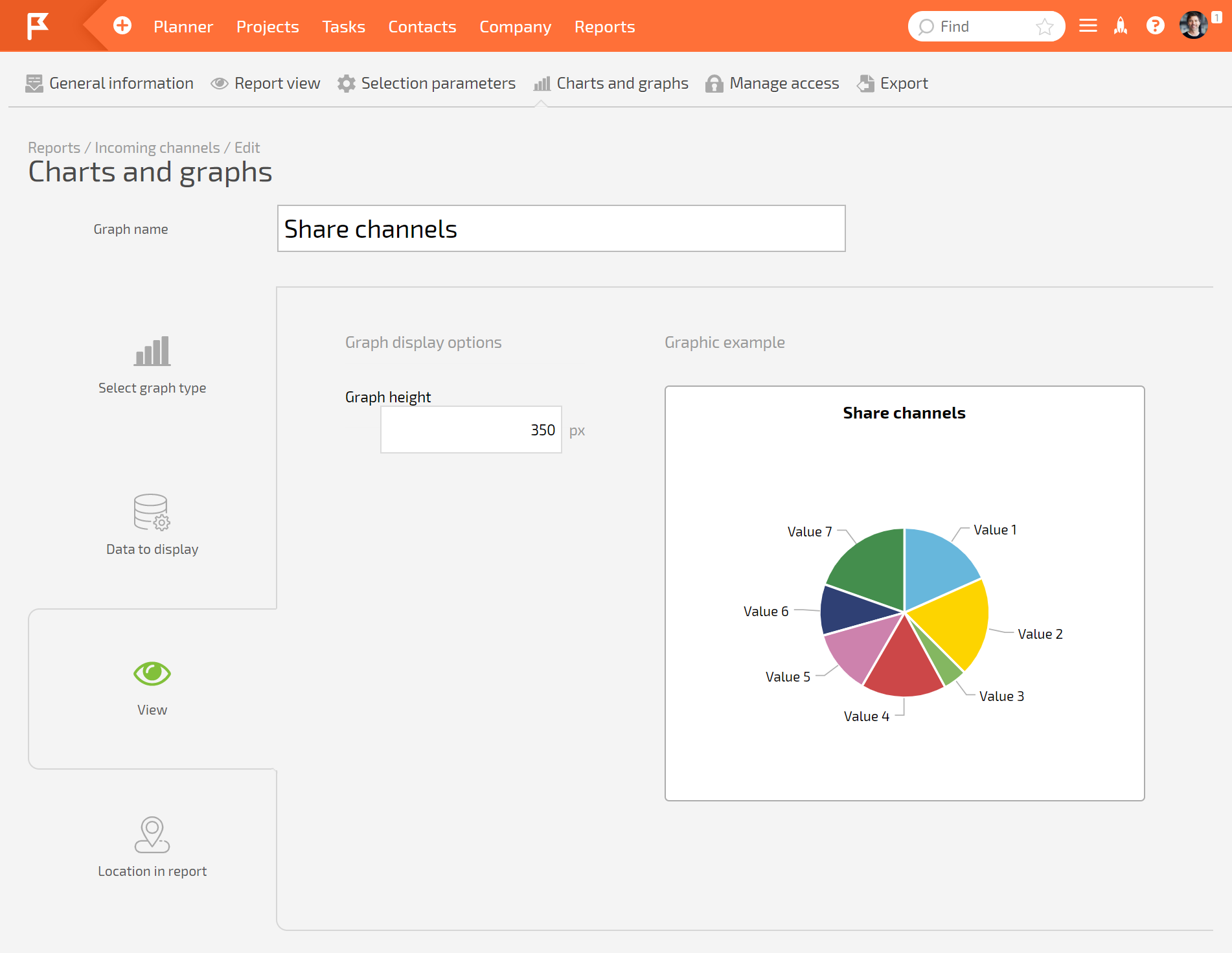
*Then you need to set the chart view: | *Then you need to set the chart view: | ||
https://pic.planfix.ru/pf/RR/iYqycp.png | https://pic.planfix.ru/pf/RR/iYqycp.png | ||
https://pic.planfix.ru/pf/V0/2Pk4xy.png | https://pic.planfix.ru/pf/V0/2Pk4xy.png | ||
https://pic.planfix.ru/pf/Zp/pNbNe7.png | https://pic.planfix.ru/pf/Zp/pNbNe7.png | ||
| Line 43: | Line 46: | ||
*You can also choose the chart position in the report. By default, charts are positioned above the body of the report, but they can be moved: | *You can also choose the chart position in the report. By default, charts are positioned above the body of the report, but they can be moved: | ||
https://pic.planfix.ru/pf/yP/VU7xNp.gif | https://pic.planfix.ru/pf/yP/VU7xNp.gif | ||
*Once you have finished, save your settings: | *Once you have finished, save your settings: | ||
| Line 51: | Line 52: | ||
https://pic.planfix.ru/pf/lc/si7RXJ.png | https://pic.planfix.ru/pf/lc/si7RXJ.png | ||
'''Additional information:''' | '''Additional information:''' | ||
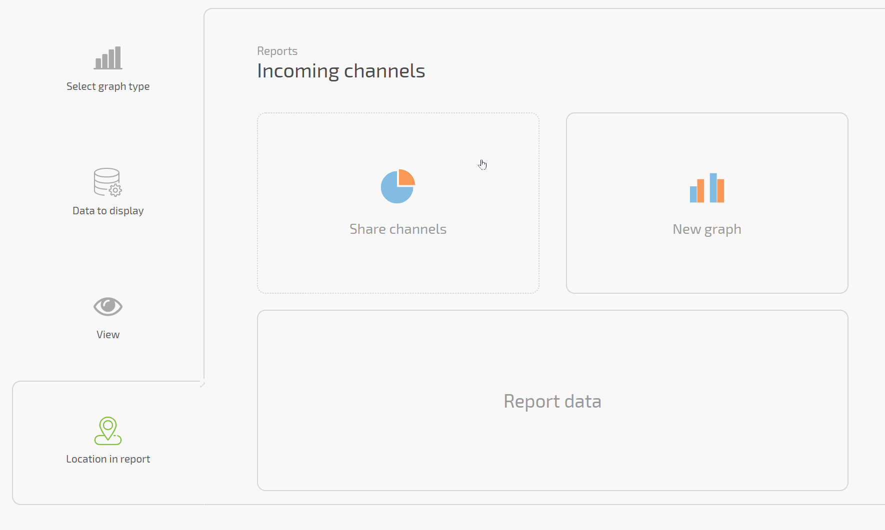
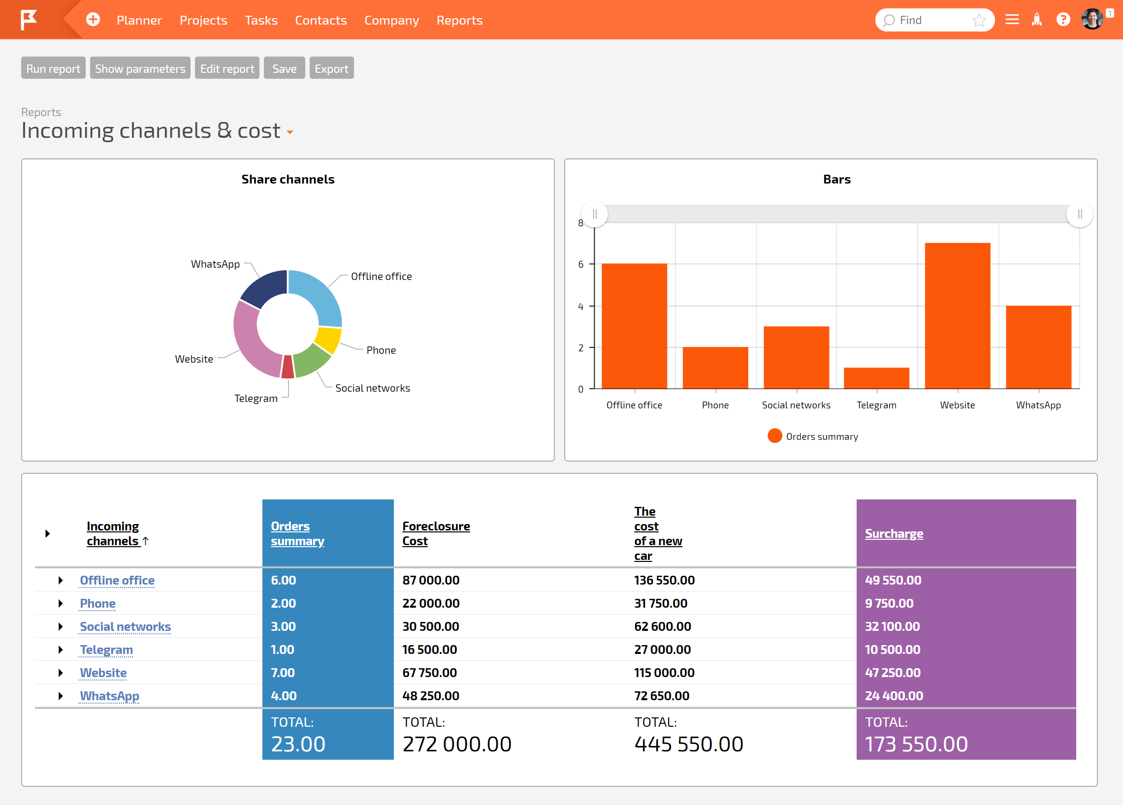
*You can add several charts to one report, grouping report data in different ways (more): | *You can add several charts to one report, grouping report data in different ways (more): | ||
https://pic.planfix.ru/pf/xq/XJtxcK.png | https://pic.planfix.ru/pf/xq/XJtxcK.png | ||
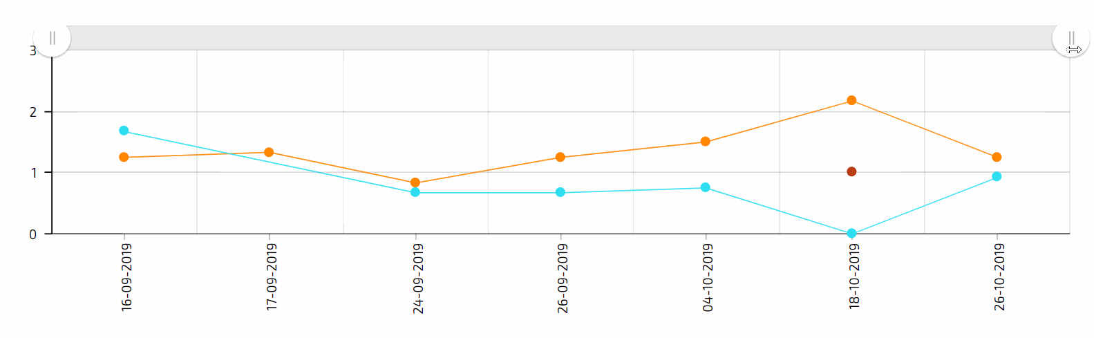
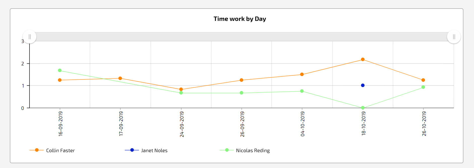
*Line graphs have sliders that provide a larger view of a specific period of time on the timeline: | *Line graphs have sliders that provide a larger view of a specific period of time on the timeline: | ||
https://pic.planfix.ru/pf/Bi/aTDphf.gif | https://pic.planfix.ru/pf/Bi/aTDphf.gif | ||
Revision as of 14:49, 25 March 2025
In Planfix, you can add one or more of the following chart types to any report:
To do this, when creating or editing a report, you need to go to the Charts and diagrams tab and click Add new chart:
- Give the chart a name and select the diagram type
- In the tab Data for display, you must select one or more report columns to build the chart with and the grouping that will be used:
Please note:
- The data displayed in the chart will depend on the grouping you choose. We recommend that you specify this grouping in the general report settings at the beginning. Run the report and make sure that you get exactly the data you're expecting in the columns you need with this grouping. Then indicate the same column and grouping in the chart settings, so you can see this exact data as a chart.
- The labels on the X axis are always taken from the grouping in the chart settings (or report settings, if no grouping is specified at the chart level). If the data isn't grouped in the chart or report settings, the labels will be taken from the source data the report is built with.
- Then you need to set the chart view:
Please note:
- The settings will be different depending on what type of diagram you choose.
- The chart height affects how it's displayed: if you only see the labels and can't see the actual chart, increase the chart height.
- You can also choose the chart position in the report. By default, charts are positioned above the body of the report, but they can be moved:
- Once you have finished, save your settings:
Additional information:
- You can add several charts to one report, grouping report data in different ways (more):
- Line graphs have sliders that provide a larger view of a specific period of time on the timeline: