Pie chart
From Planfix
A pie chart is one of the chart types available in Planfix reports. It visualizes data as slices of a circle. Each slice represents a specific category and reflects its proportion in relation to the whole circle.
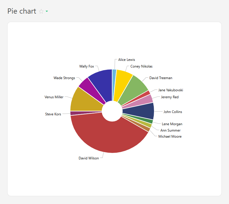
For example, this chart can show the tasks completed by employees in a month:
A pie chart is based on report data and consists of a circle divided into sectors:
- Each sector represents a category (e.g., department, project, task status).
- The size of the sector is proportional to a numerical value (e.g., the number of tasks, budget share, time spent).
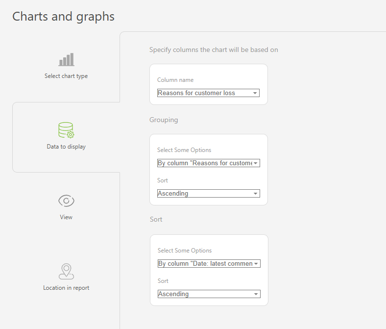
To ensure the correct data is displayed, use grouping and sorting.
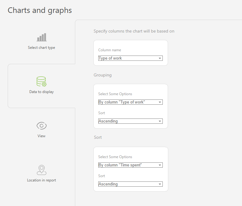
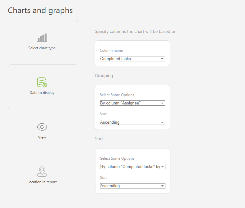
Setup
- In the "Report view", add the columns that will form the pie chart.
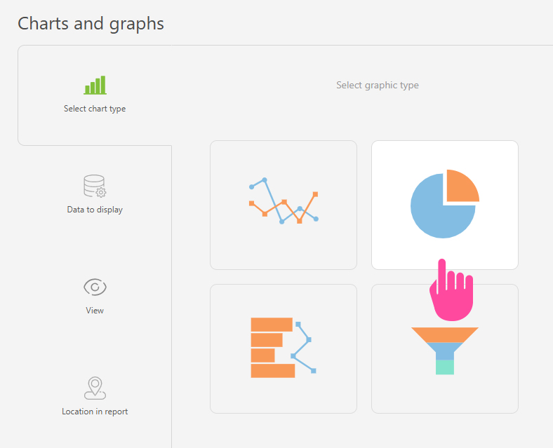
- Go to the "Charts and graphs" section and add a new "Pie" type chart.
- In "Data to display", set the following:
- Columns:"Completed tasks".
- Grouping:By the "Assignee" column.
- Sort:by the "Completed tasks" column, by month, ascending.
- In the "View" section, you can adjust:
- Chart height – defines the height of the chart in pixels.
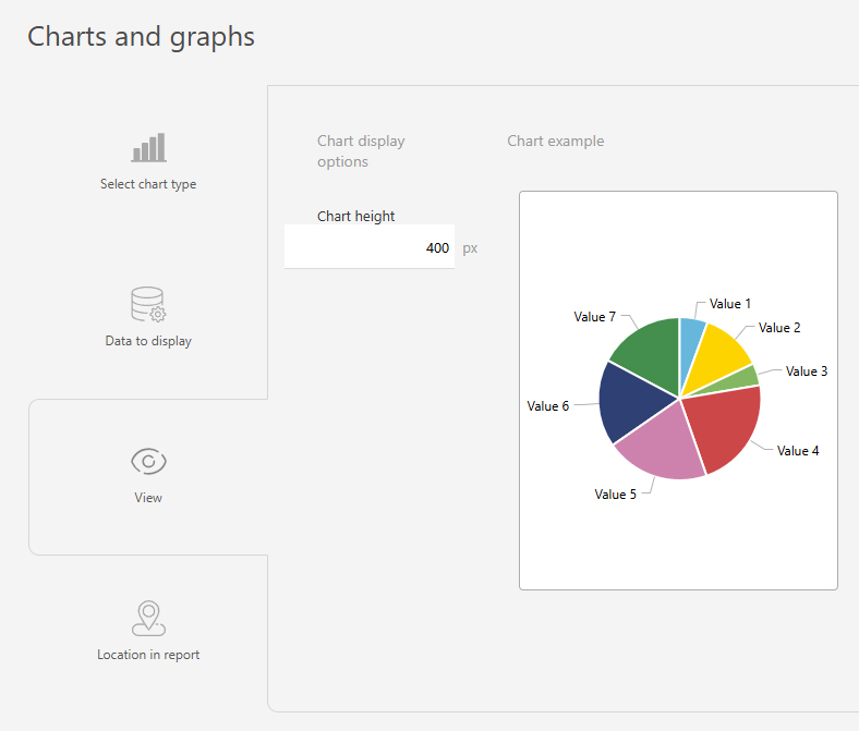
- Save the chart and run the report to view the results.
Use case examples
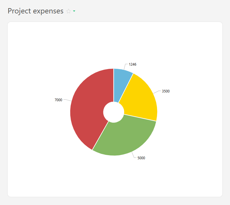
- Project expenses:

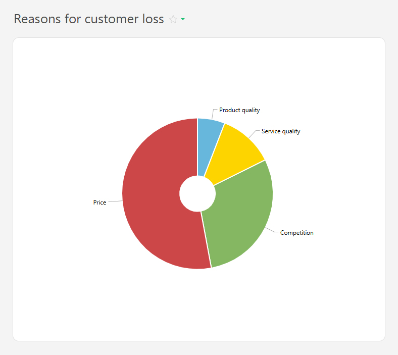
- Reasons for customer loss:
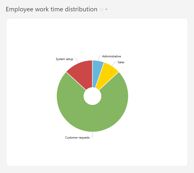
- Employee work time distribution: