Funnel chart
From Planfix
The Funnel is a chart type available in Planfix reports. It visualizes data as a series of levels — the wider the level, the greater the value it represents.
For example, this is what the levels of the sales funnel look like for the current month:

The funnel is created from report data and consists of two core elements:
- Levels — represent categories (e.g., deal stages, request processing stages, or task progress).
- Level widths — reflect numerical values (e.g., the number of deals, tasks, or requests in each stage).
To visualize your data correctly, it is essential to group and sort it.
Setup
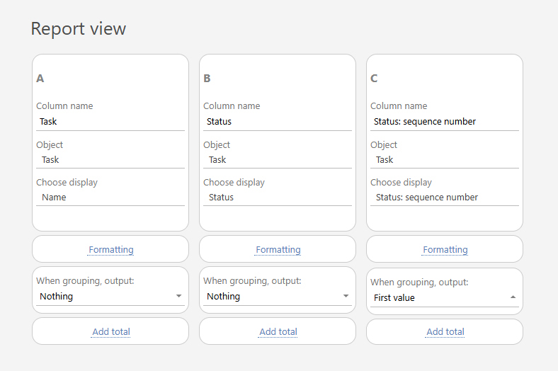
- In the "Report view section", add the columns that will form your funnel. Make sure to include the "Status" and "Status: sequence number". These fields ensure that funnel stages appear in the correct order and quantity. These fields ensure that funnel stages appear in the correct order and quantity.
- Use selection parameters to filter the data that is included in the report. Under "Data filter", for example, you can specify a specific object or project.
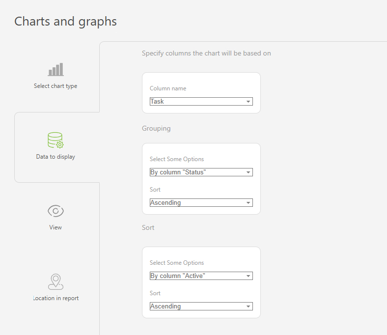
- Go to the "Charts and graphs" section and add a new chart of the "Funnel" type:

- Enter the following in the Data to display" section:
- Column that will be used to build the chart: "Task"
- Grouping: by the "Status" column, in ascending order
- Sort: by the "Status: sequence number" column, in ascending order

- In the "View" settings, you can adjust:
- "Chart height" — sets the height in pixels for the chart display.

- Save your funnel chart and run the report to view your data in a visual funnel format.
Use case examples
- Recruitment process stages:

- Project stage analysis:
