Bar chart: Difference between revisions
From Planfix
(Created page with "{{#seo: |title= Bar chart |titlemode=append |keywords=planfix, reports, report, diagram, diagram type, chart type |description=Bar type chart }}") |
|||
| (13 intermediate revisions by the same user not shown) | |||
| Line 5: | Line 5: | ||
|description=Bar type chart | |description=Bar type chart | ||
}} | }} | ||
The Bar chart is a chart type available in [[Reports: Charts in reports|reports]]. It displays data as vertical bars, with each bar representing a value or quantity that corresponds to a specific category. Bar charts are useful for comparing data. | |||
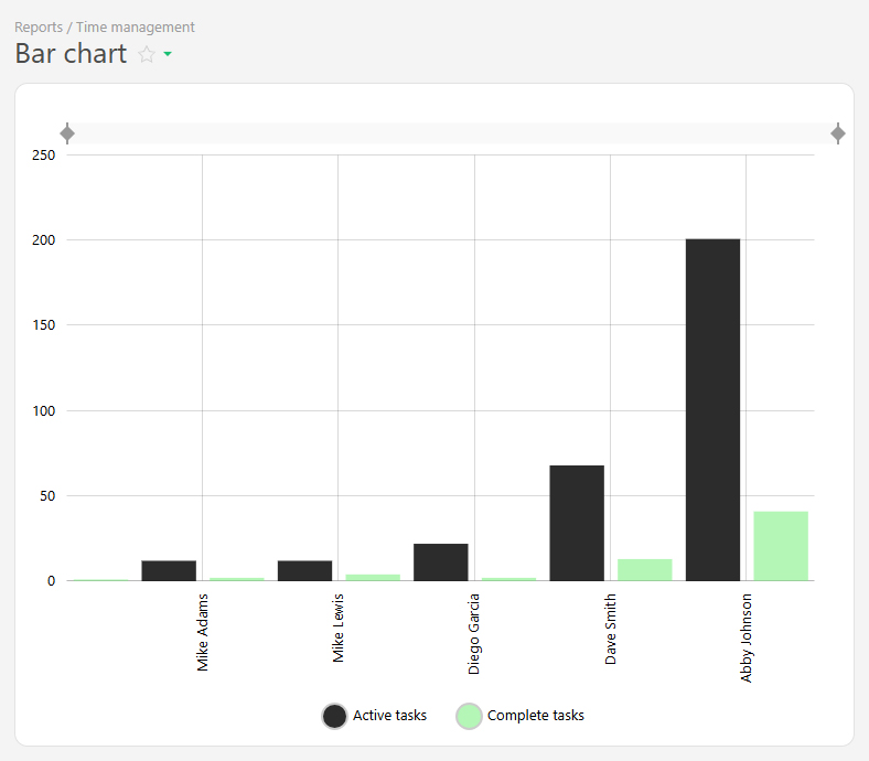
For example, the active and completed tasks per employee for a month can be displayed: | |||
https://s.pfx.so/pf/A2/l4QW5j.jpg | |||
The bar chart is created from report data and consists of two axes: | |||
*Horizontal axis (X) — represents categories (e.g., days of the week, project names). | |||
*Vertical axis (Y) — represents numerical values (e.g. number of tasks completed, hours worked, sales amounts). | |||
To ensure that relevant data is displayed, use grouping and sorting. | |||
==Setup== | |||
*In the "Report view", add the columns that will form the bar chart. | |||
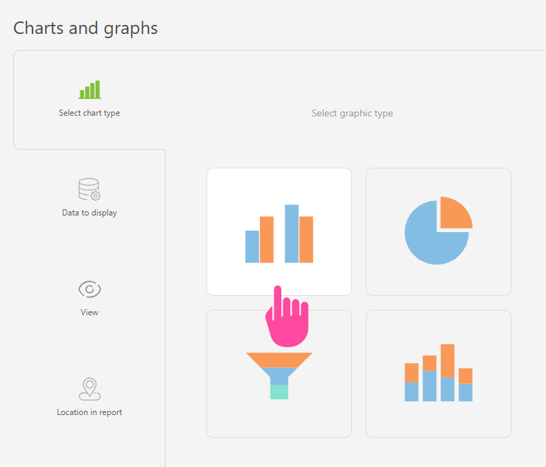
*Go to the "Charts and graphs" section and add a new "Bar" type chart: | |||
https://s.pfx.so/pf/M8/AJNXvr.jpg | |||
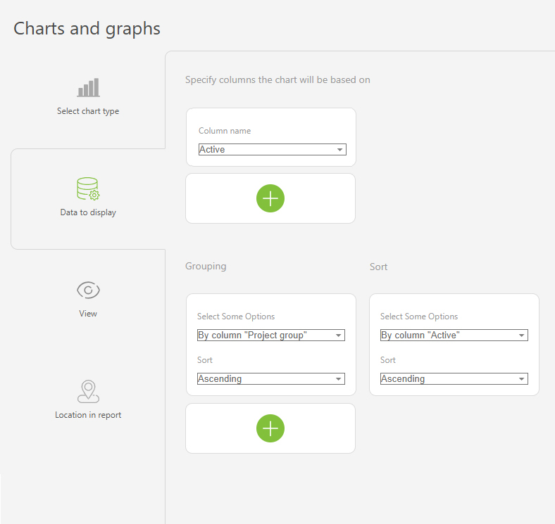
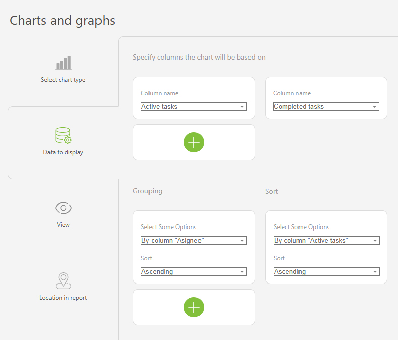
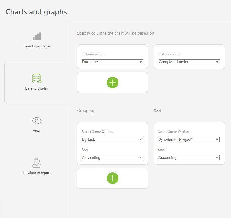
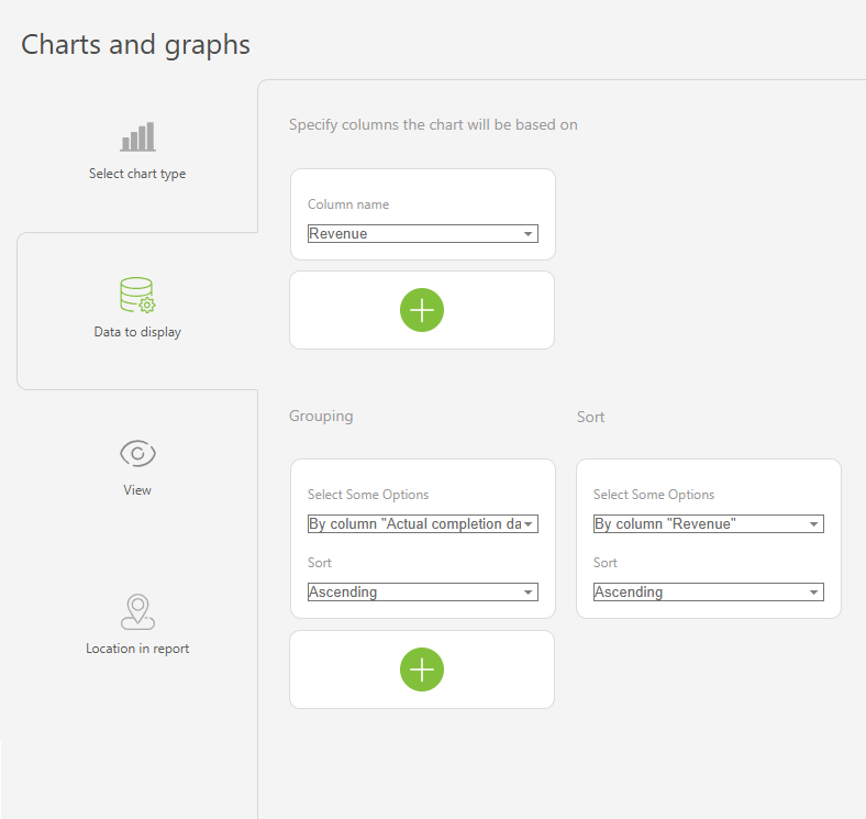
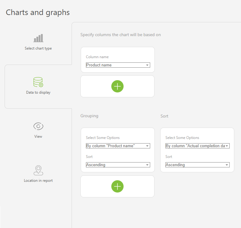
*In "Data to display", set the following: | |||
**Columns on which the chart will be based: "Active tasks", "Completed tasks". | |||
**Grouping: By the "Assignee" column. | |||
**Sort: by the "Active tasks" column, ascending. | |||
https://s.pfx.so/pf/GD/UCTQWb.jpg | |||
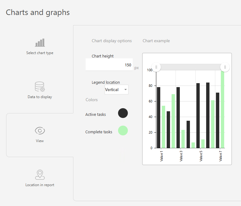
*In the "View" section, you configure how the chart is displayed: | |||
**Chart height — defines the height of the chart in pixels. | |||
**Legend location — controls how the axis labels are displayed. Tip: Use "Vertical" for longer labels to save space, "Horizontal" is best for shorter labels. | |||
**Colors — helps to differentiate between data groups using different colors. | |||
https://s.pfx.so/pf/W4/f1b7kA.jpg | |||
*Save the chart and run the report to view it. | |||
==Use case examples== | |||
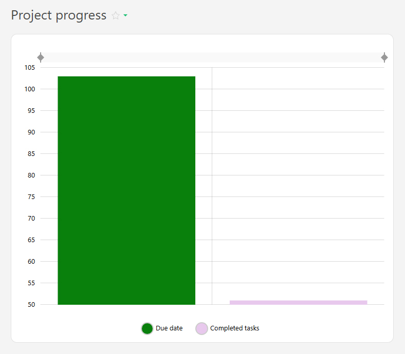
*Project progress | |||
https://s.pfx.so/pf/kz/OOHHDf.jpg | |||
https://s.pfx.so/pf/pg/LEf7q3.jpg | |||
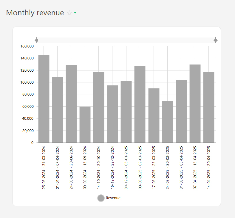
*Revenue by month | |||
https://s.pfx.so/pf/8V/VzzDp5.jpg | |||
https://s.pfx.so/pf/WB/A4YHHH.jpg | |||
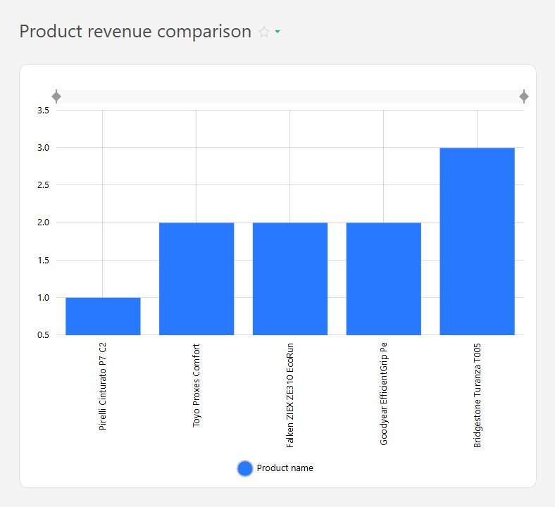
*Revenue by individual products | |||
https://s.pfx.so/pf/1U/oafn6S.jpg | |||
https://s.pfx.so/pf/UW/2ypT52.jpg | |||
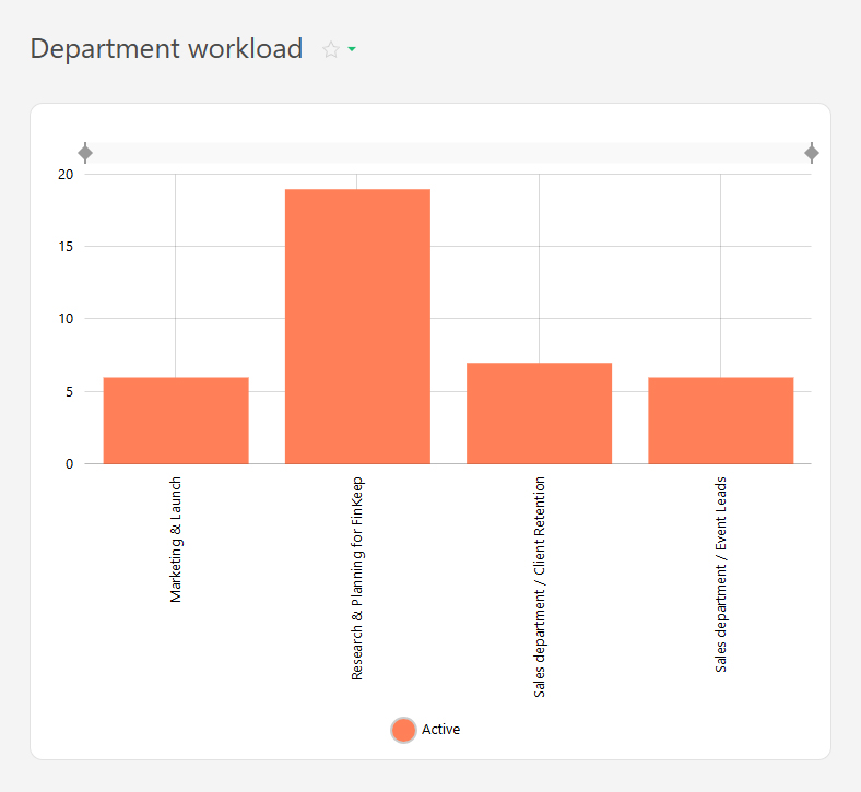
*Department workload level | |||
https://s.pfx.so/pf/HA/r2DZMI.jpg | |||
https://s.pfx.so/pf/LJ/FECJuN.jpg | |||
== Go To == | |||
*[[Reports: Charts in reports|Charts in reports]] | |||
*[[Reports]] | |||
Latest revision as of 07:21, 15 July 2025
The Bar chart is a chart type available in reports. It displays data as vertical bars, with each bar representing a value or quantity that corresponds to a specific category. Bar charts are useful for comparing data.
For example, the active and completed tasks per employee for a month can be displayed:
 The bar chart is created from report data and consists of two axes:
- Horizontal axis (X) — represents categories (e.g., days of the week, project names).
- Vertical axis (Y) — represents numerical values (e.g. number of tasks completed, hours worked, sales amounts).
To ensure that relevant data is displayed, use grouping and sorting.
Setup
- In the "Report view", add the columns that will form the bar chart.
- Go to the "Charts and graphs" section and add a new "Bar" type chart:
- In "Data to display", set the following:
- Columns on which the chart will be based: "Active tasks", "Completed tasks".
- Grouping: By the "Assignee" column.
- Sort: by the "Active tasks" column, ascending.
- In the "View" section, you configure how the chart is displayed:
- Chart height — defines the height of the chart in pixels.
- Legend location — controls how the axis labels are displayed. Tip: Use "Vertical" for longer labels to save space, "Horizontal" is best for shorter labels.
- Colors — helps to differentiate between data groups using different colors.
- Save the chart and run the report to view it.
Use case examples
- Project progress
- Revenue by month
- Revenue by individual products
- Department workload level