Line chart
From Planfix
The Line chart is one of the chart types available in Planfix reports. It displays data as points connected by lines and is therefore ideal for visualizing trends over time or relationships between values. This chart is suitable for tracking changes such as task completion, sales growth or project progress.
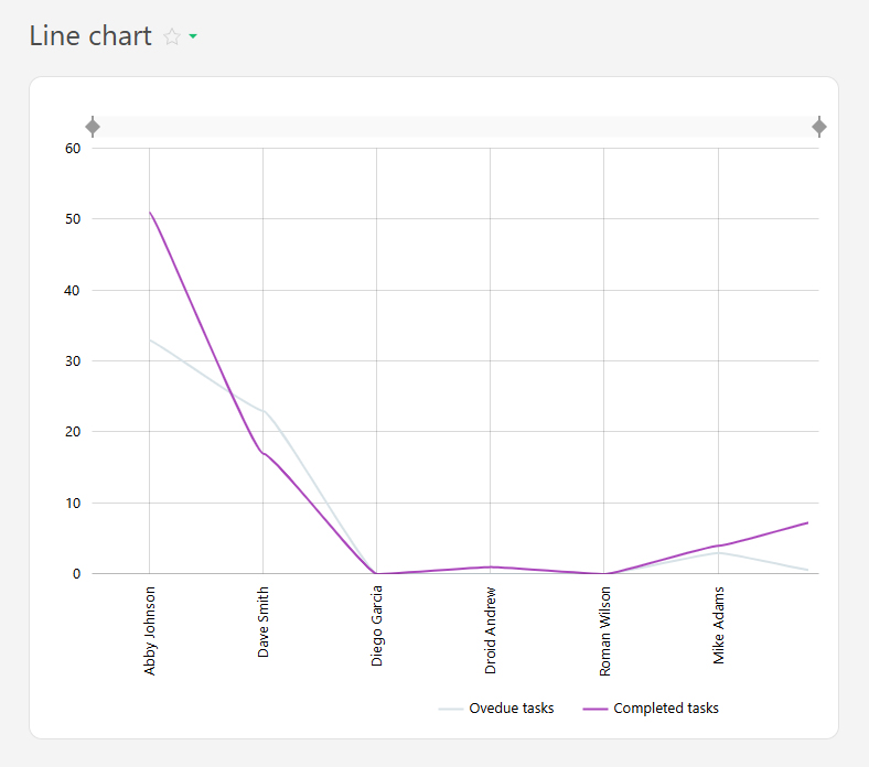
For example, you can display overdue and completed tasks by employee over the past month like this:
The line chart is created from report data and consists of two axes:
- Horizontal axis (X) — represents categories (e.g., days of the week, project names).
- Vertical axis (Y) — represents numerical values (e.g. number of tasks completed, hours worked, sales amounts).
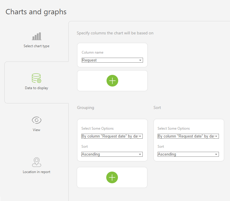
To ensure that relevant data is displayed, use grouping and sorting.
Setup
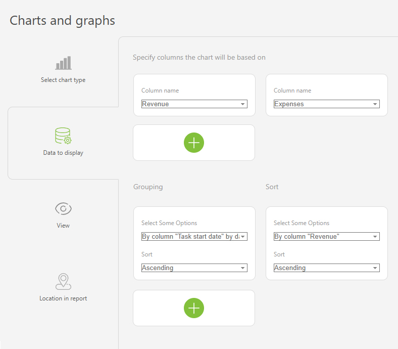
- In the "Report view", add the columns that will form the line chart.
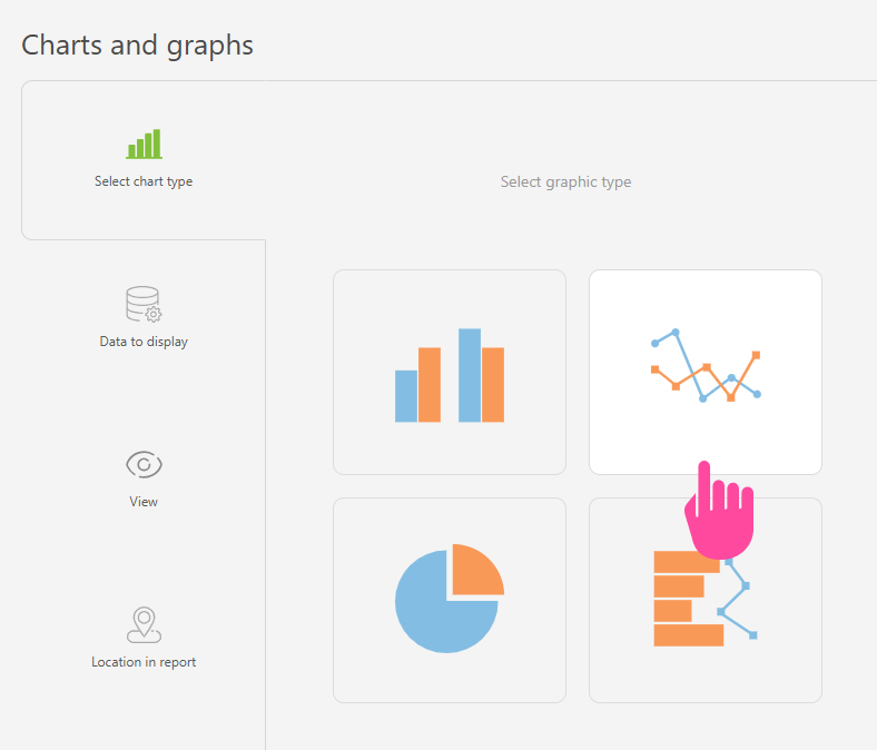
- Go to the "Charts and graphs" section and add a new "Line" type chart:
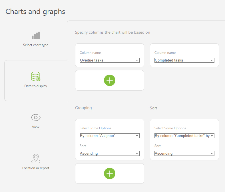
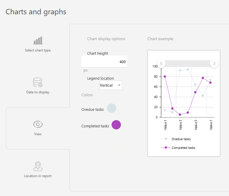
- In "Data to display", set the following:
- Columns on which the chart will be based: "Overdue tasks", "Completed tasks".
- Grouping: By the "Assignee" column.
- Sort: by the "Completed tasks" column, by month, ascending.
- In the "View" section, you configure how the chart is displayed:
- "Chart height" — defines the height of the chart in pixels.
- "Legend location" — controls how the axis labels are displayed. Tip: Use "Vertical" for longer labels to save space, "Horizontal" is best for shorter labels.
- "Colors" — helps to differentiate between data groups using different colors.
- Save the chart and run the report to view it.
Use case examples
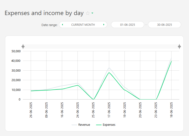
- Expenses and income by day:
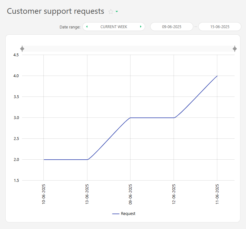
- Number of support requests by day
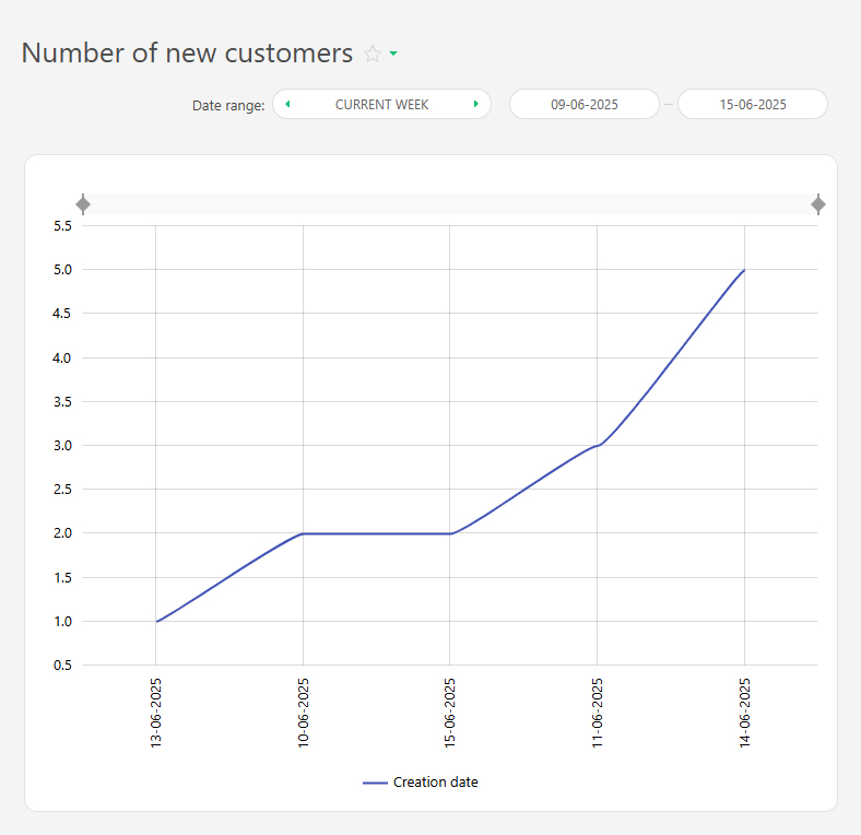
- New customers this week