Combined chart
From Planfix
A Combined Chart in Planfix reports allows you to combine two different types of charts into a single visualization:
- Bar chart – Displays data as vertical columns of varying heights to show quantitative values.
- Line chart – Connects data points with a line to visualize trends over time.
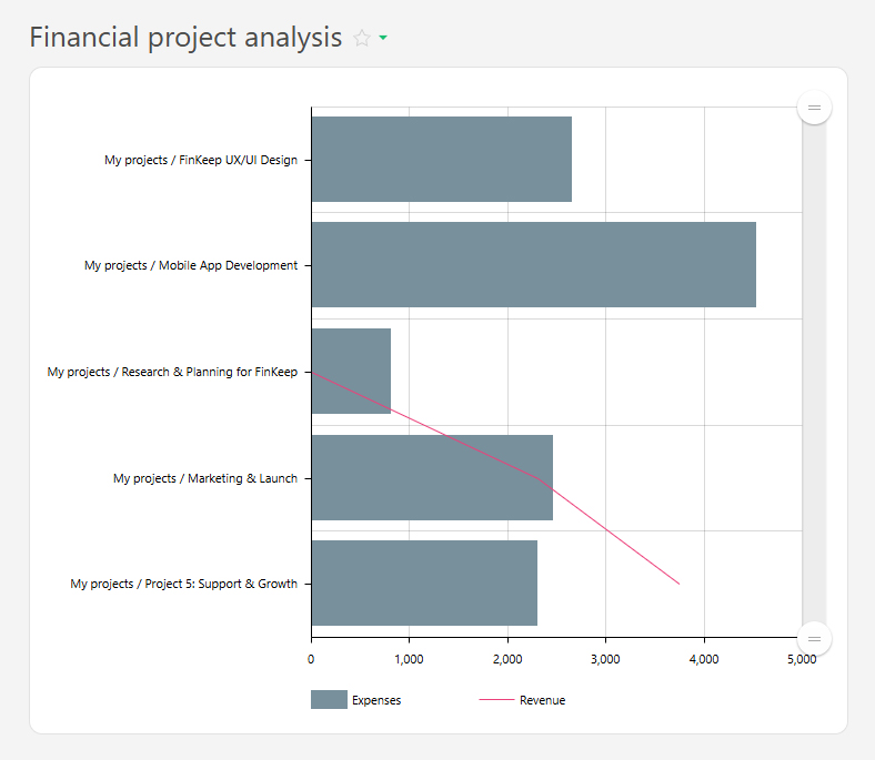
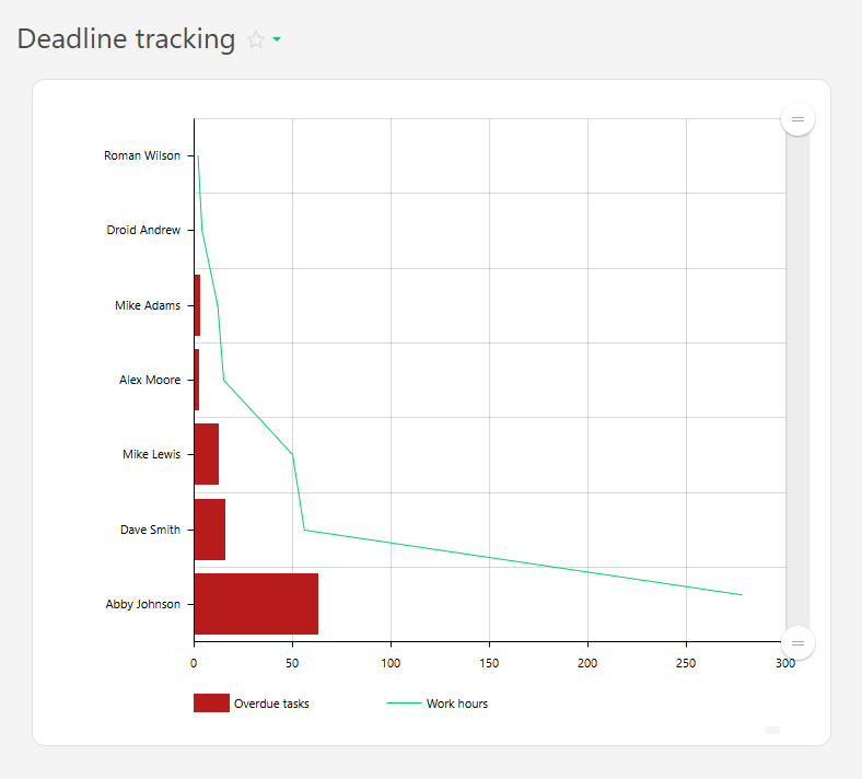
This chart type is useful for comparing different metrics, even those measured in different units, within a single report. For example, you can display the number of tasks completed by employees in a month alongside the time spent on those tasks based on data tags:
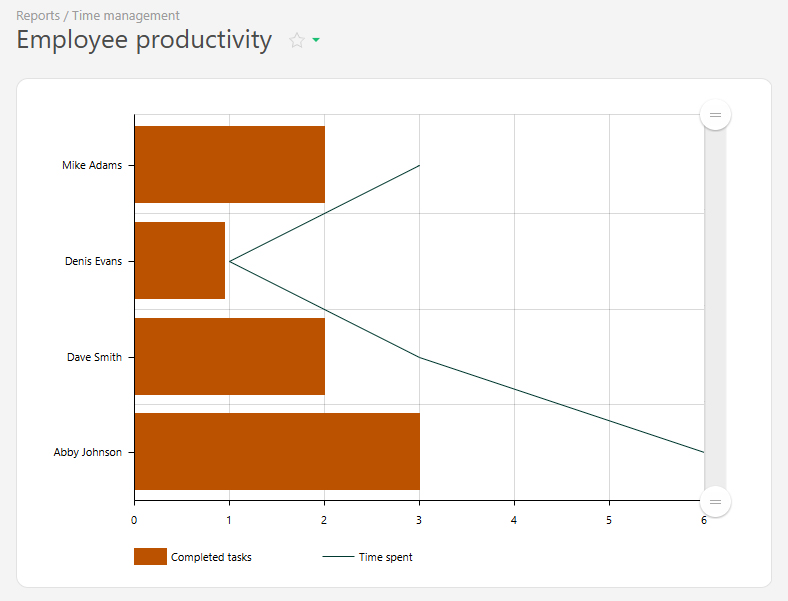
The chart is built using report data and consists of four main components:
- X-axis (horizontal) – Shows categories such as employees, projects or days of the week.
- Y-axis (vertical) – Displays numeric values such as the number of completed tasks, hours worked, or sales volume.
- Bars – Represent one metric (e.g., the total number of completed tasks).
- Line – This represents another key figure (e.g., the total time logged, as specified in the data tags).
To display the appropriate data, use group and sort features.
Setup
- In the "Report view" section, add the data columns that you want to include in the chart.
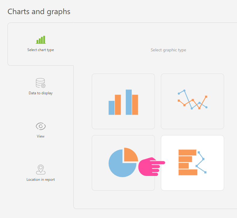
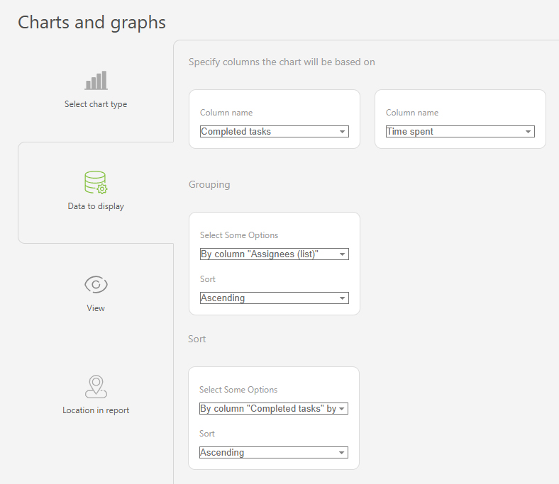
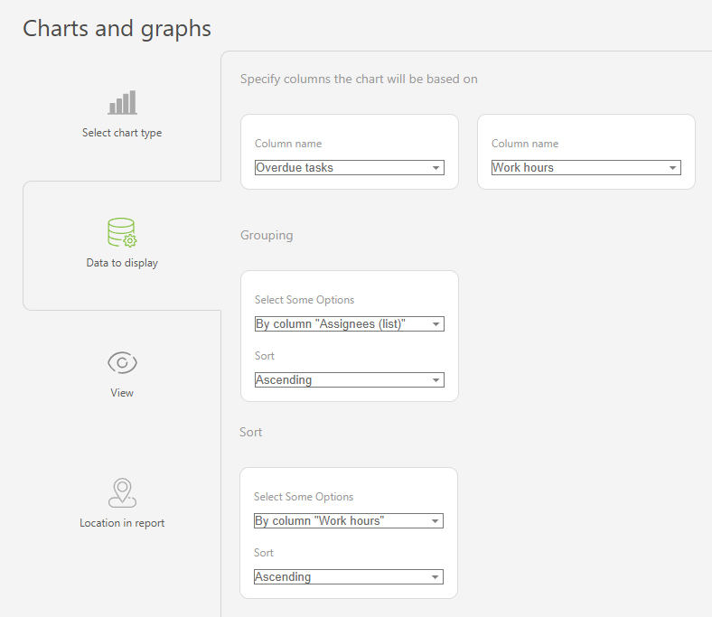
- Go to "Charts and graphs" and add a new chart of the type "Combined chart":
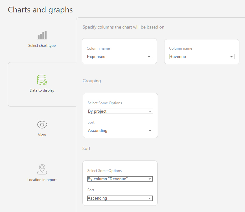
- In "Data to display", set the following values:
- Data columns for the chart: "Completed tasks" and "Time spent"
- Grouping: by "Assignee (list)", ascending
- Sorting: by "Completed tasks" by month, ascending
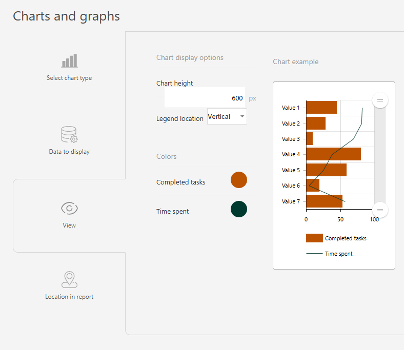
- In the "View" section, you can configure:
- Chart height – defines the height of the chart in pixels.
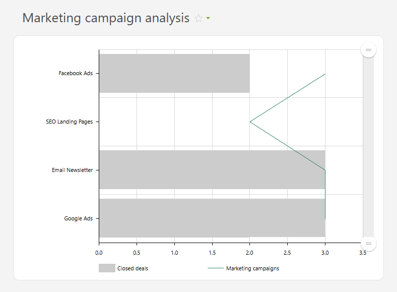
Use case examples
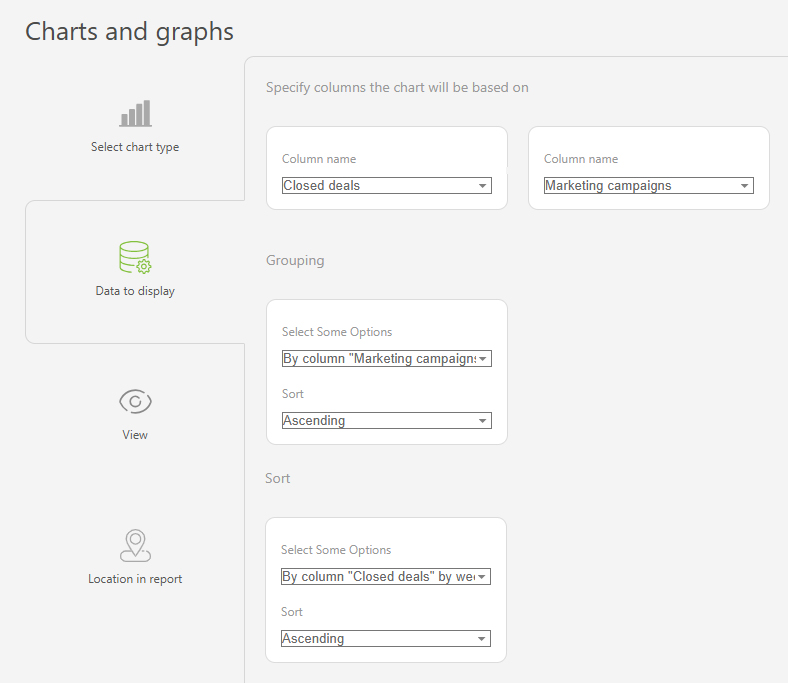
- Marketing campaign analysis
- Deadline tracking
- Financial project analysis