What does Planfix look like?
We know this is the very first question that comes up when getting acquainted with any new system. To help you quickly understand what the Planfix interface looks like, we’ve gathered several screenshots from different sections of the system:
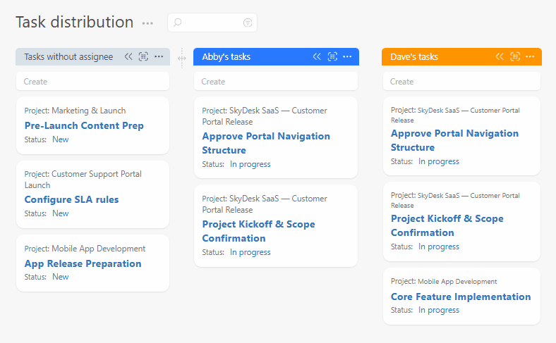
Planner
Planner is the main tool for creating convenient workspaces. A single planner can contain different types of task lists — from tables to calendars. Moving a task from one list to another changes not only how it is displayed, but also updates the task’s field values or may even create new objects:
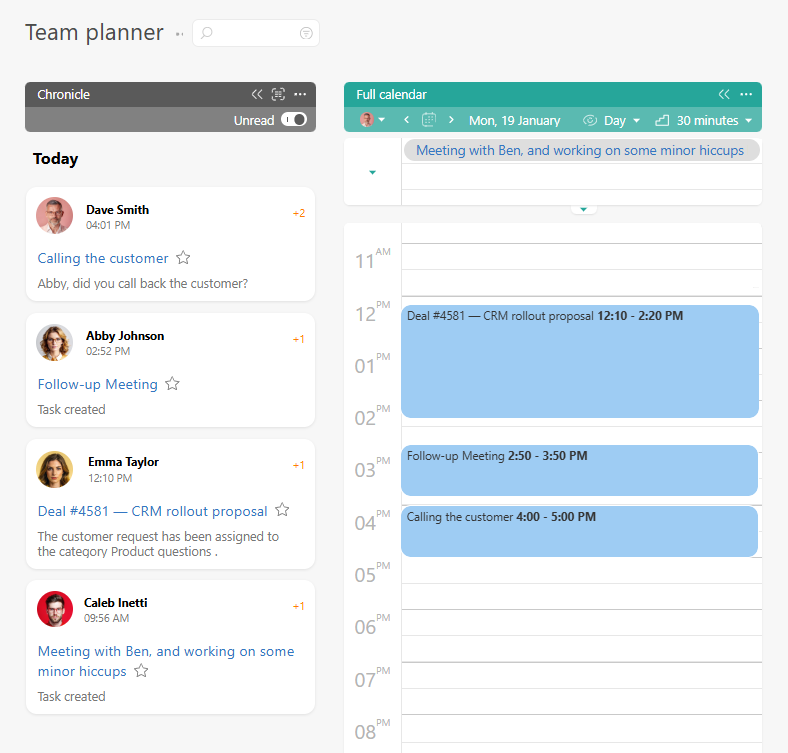
You can also plan employees’ work (or your own) here with any level of detail — from simply setting a due date to creating a detailed hour-by-hour plan for working on a task:
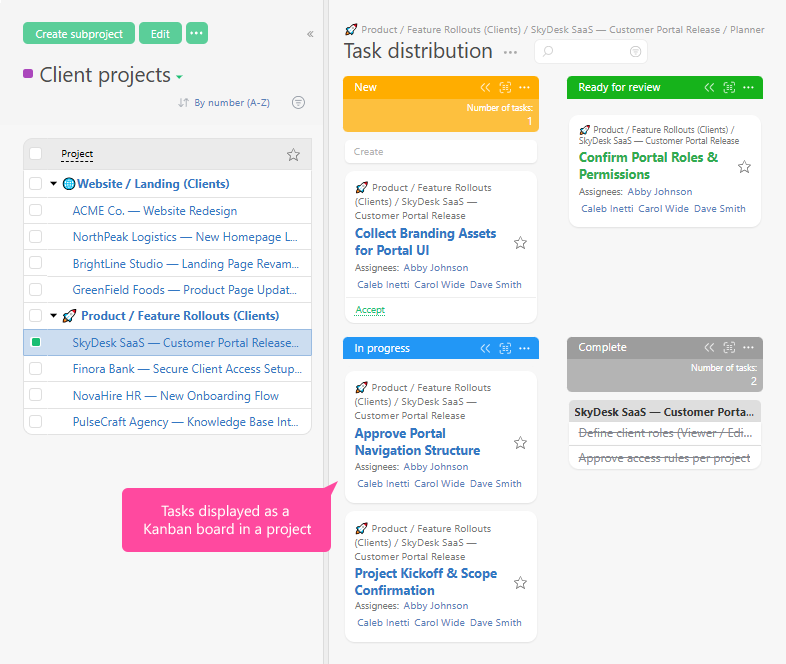
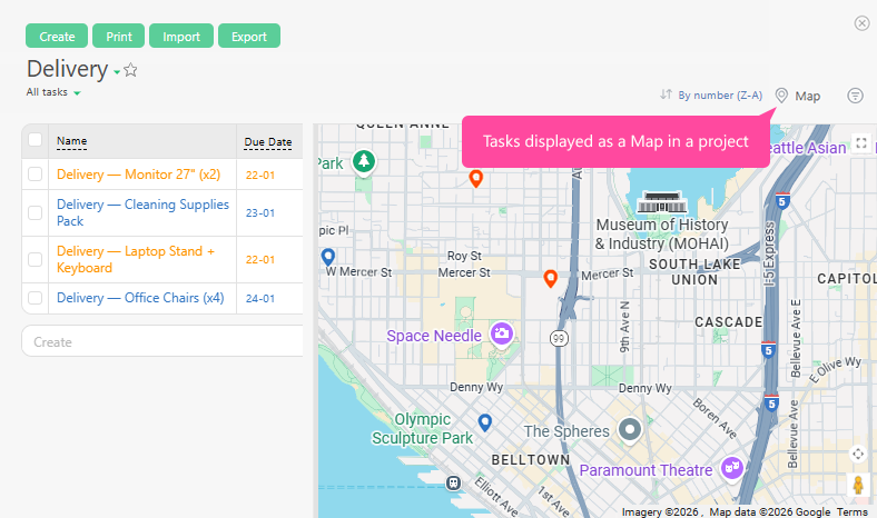
Projects
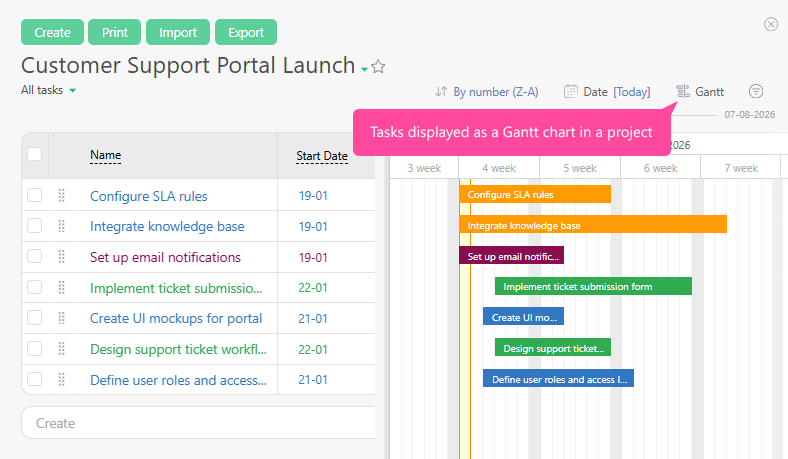
Tasks within a project can be displayed in different ways — from a Gantt chart to a Kanban board and a map view:
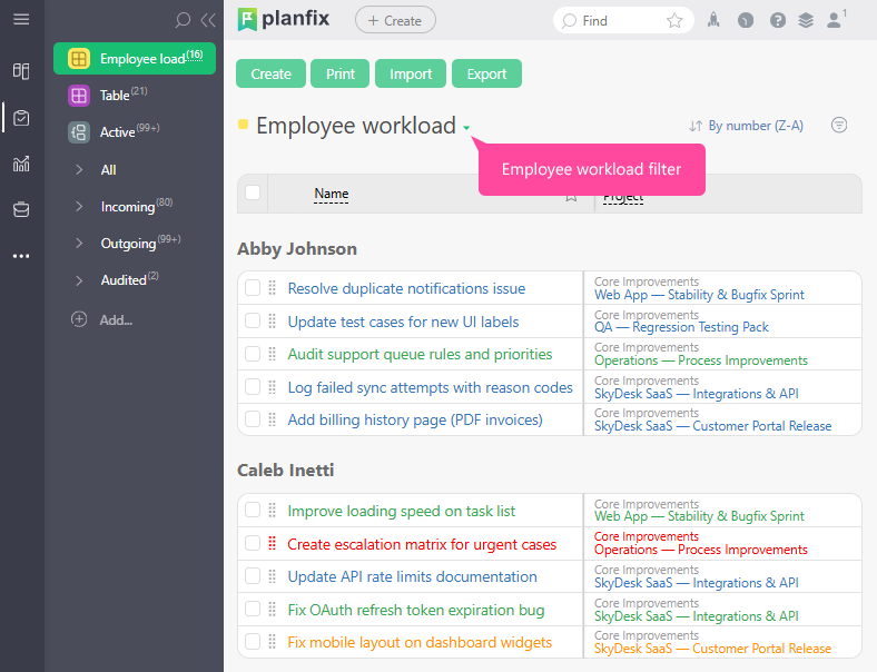
Tasks
In the Tasks section, you can always see the full list of tasks and filter it using the selection parameters you need.
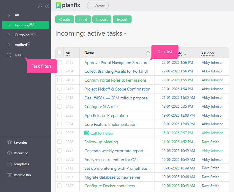
You decide which task fields should be displayed in the list — and different lists can show different sets of fields:
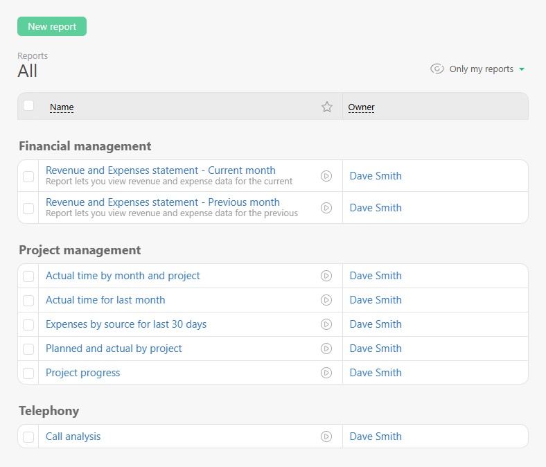
Reports
Planfix stands out from most other systems thanks to its ability to track data and automatically generate Reports based on parameters you define yourself:
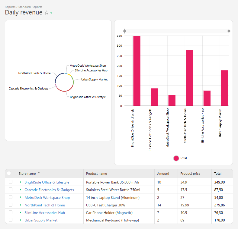
Using the report builder, you can not only collect raw data and calculate the metrics you need, but also visualize everything as charts and diagrams:
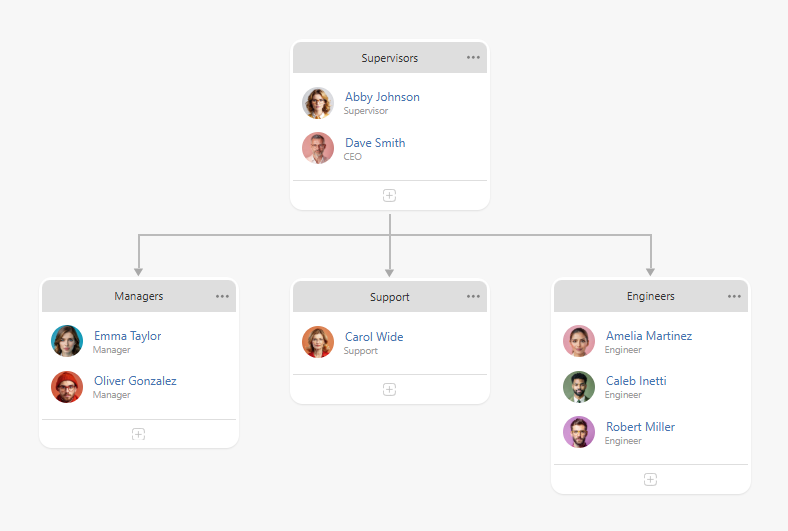
Company structure
Company structure lets you clearly visualize the hierarchy of departments and teams. It also allows you to grant supervisors access to their subordinates' tasks.